
Back to Blogs
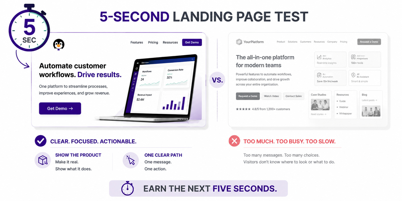
A B2B landing page has only seconds to earn continued attention. Sahil Patel of Spiralyze explains how bold claims, visible products, skimmable structure, relevant proof, focused calls to action, and meaningful tests can reduce common conversion barriers while helping visitors understand what a company offers and whether taking the next step feels worth their time.
A landing page cannot convert a visitor who does not stay long enough to understand the offer. Before someone requests a demonstration, starts a trial, or completes a form, the page needs to establish enough relevance to earn another few seconds.
In a Renegade Marketers Unite conversation about landing-page conversion, Sahil Patel, CEO of Spiralyze, reviewed common conversion barriers and applied his recommendations directly to CMO Huddles pages.
His framework centers on attention, clarity, product visibility, appropriate proof, focused experiences, and tests large enough to teach the team something useful.
A visitor may be comparing several alternatives, responding to a campaign, or moving quickly between browser tabs. The first screen has limited time to answer three questions:
Sahil defines the initial objective narrowly.
“Your job is not to convince your audience to buy the product today. It’s not even to convince them that your product is better than your competitors. It’s to hook their attention.”
This reduces the burden placed on the hero section. It does not need to explain the entire product, establish every differentiator, and complete the sale.
A clear category, meaningful claim, focused visual, and visible next step can establish enough interest for the visitor to continue.
Sahil asks teams to imagine that the homepage or landing page has been placed on a billboard beside a highway. A driver moving quickly cannot process a complicated origin story, a long paragraph, or a feature catalog.
Sahil extends the billboard comparison to the way people encounter a digital page.
“Your audience is going to make up their mind in the first one to three seconds if they’re even going to stay.”
That short decision window makes skimmability especially important. The implication is not that every page needs to be extremely short. It needs to be skimmable enough for visitors to find the information that matters.
Short sections, descriptive headings, meaningful visual hierarchy, and focused supporting points can help the page reward scanning rather than punish it.
Broad slogans can sound polished while leaving visitors uncertain about what the company provides. Specific language gives them something concrete to evaluate.
The claim may identify:
The headline and supporting copy work together. The headline earns attention, while the next line can clarify the category, audience, or mechanism.
Clarity does not require removing personality. It requires ensuring that creativity does not conceal what the visitor is being offered.
Many B2B software pages rely on generic photographs or abstract illustrations while keeping the actual product out of view. Sahil’s testing points in another direction.
“The data shows overwhelming when you show a bold, beautiful picture of your product, it beats showing happy people, because, by the way, that’s why your customer came there.”
A product image makes the offer tangible. It gives visitors a quick sense of what they are evaluating and can help them imagine using it.
The screenshot does not need to display the entire platform. Sahil suggests asking salespeople which moment consistently creates excitement during a demonstration. That moment can become the visual focus.
Dense interfaces may need highlighting, cropping, or annotation so the viewer knows where to look. The objective is clarity, not comprehensive documentation.
Service companies also have something they can show. The product may be the people, process, deliverable, environment, or experience the customer receives.
Possible visuals include:
Sahil described tests in which photographs of service professionals outperformed generic images of happy customers. The service team gave prospective buyers a clearer view of what they were purchasing.
The most effective representation depends on the business, but the principle remains useful: Show the offer instead of relying entirely on abstract imagery.
Different audiences may look for different forms of reassurance.
“Enterprise tends to convert better with logos, the mid-market and SMB tend to convert better with testimonials.”
Recognizable logos can signal scale, sophistication, and the ability to support organizational complexity. A relevant enterprise buyer may quickly recognize that comparable companies trust the vendor.
Mid-market and smaller businesses may find a detailed testimonial more persuasive because it presents a person and situation resembling their own.
The distinction is not universal. It demonstrates why proof can be matched to the audience and the question that audience is trying to resolve.
Combining proof can also be effective. Logos provide immediate recognition, while testimonials add context and explain the value experienced by the customer.
A homepage may need to serve several audiences. A campaign landing page usually has a narrower purpose.
Excessive navigation, unrelated content, several competing calls to action, and a long form can distract from the intended next step. Each option adds another decision before the visitor reaches the action the campaign was designed to support.
Focus does not require making every landing page short. A longer page can work when each section answers a relevant question and advances the same conversion argument.
The page becomes weaker when it attempts to explain the company to investors, recruit employees, tell the founder story, support existing customers, and generate a sales inquiry at the same time.
Sahil also addressed the role of video on a conversion page.
“Video is a huge distractor and cannibalizes conversions.”
Sahil does not argue that video has no value. A prominent video can become a competing path when high-intent visitors are ready to evaluate the offer or complete the primary action.
Moving video lower on the page may allow it to support visitors who want additional explanation without requiring everyone to watch before proceeding.
A product demonstration or customer story can become valuable after the page has established relevance. Placement can be evaluated according to page intent, visitor behavior, and conversion data.
A button labeled “Submit” explains what the interface will do. It does not tell the visitor what they will receive.
A more descriptive call to action can clarify the next step:
Form length also communicates effort. Additional fields may improve qualification while reducing completion. The appropriate balance depends on the value offered and the visitor’s stage in the journey.
A high-intent enterprise request may justify more information than an early educational download.
Limited B2B traffic also affects what teams can reasonably learn from an experiment.
“To win big, got to swing big.”
A meaningful test might compare:
The downstream measure matters. A version generating more form submissions may still underperform if those submissions are poorly qualified or less likely to become customers.
The most useful experiment tests a clear hypothesis and measures an outcome connected to the business.
Visitors may decide within one to three seconds whether the page appears relevant enough to explore.
A clear category, meaningful claim, focused visual, relevant proof, and one primary next step can establish relevance.
Not universally. A prominent video can distract from the primary action, making placement and page intent important variables to test.
It compares meaningful differences, measures a relevant downstream outcome, and runs with enough traffic to support a reliable conclusion.
Listen to the full conversation with Sahil Patel.
CMO Huddles helps B2B marketing leaders win by bringing together peers, fresh perspectives, and opportunities to build stronger personal brands. Want to join the huddle? Learn more about CMO Huddles and join CMO Huddles Starter.